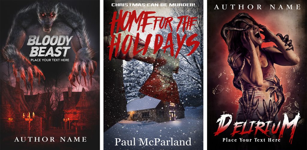
To design a creepy horror cover it’s important to have the audacity to use shocking and sometimes repulsive imagery to convey a clear message of the story it represents.
There are no specific rules for this genre, the more horrible it is the more impressed the reader is. The favorite colors for this genre are bright red and black, but colors like brown, yellow, gray and blue also work well. Black is almost always present, it represents death, mystery, nightmare. Red represents violence, blood, aggression. The yellow color is attributed to mystery, betrayal and madness. Brown is the union of the characteristics of red, yellow and blue. Blue at night, in the dark, in the dark and in the cold. Gray represents dirt, sadness, isolation. All of these colors are usually used to create terrifying horror covers. I usually don’t use more than two colors to make a horror cover, one of which is gray or black.
Blood, sharp teeth and slobbering mouths, human limbs, amputated and bleeding limbs, instruments of torture, terrifying monsters, zombie, cannibals. There may be even only details that suggest the concept of the story, a bloody knife, a machete, a pool of blood, dark eyes or simply a dark silhouette looking behind a window.
Important are the environments that must be dark and inhospitable places such as basements, an attic, buildings in ruins, woods, cemeteries, monasteries, isolated houses and disturbing and inhospitable landscapes. The cover must convey danger and surprise for the victims who are the protagonists of the story.
Sometimes these covers can have stylized and conceptual and symbolic graphics so that the reader is not diverted
The fonts I use for this type of story are irregular and grunge, for example the violence font, Againts, Another America, Night of Terror, Chiller, Boycott, Ravenscroft, Scream real, Akoom, Haze Dark, Inhumanity, Martyric.
You can also find my covers for sale on thebookcoverdesigner website
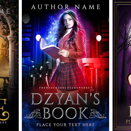
Here are some covers I designed for the horror stories


